Quick start
If you want to dive right in, just type pit from a command line.
The startup data is loaded and you can familiarize yourself with the layout
and the most basic functionality.
You can alternatively load a set of MRI brain scan data that is perhaps more
intuitive to understand by using the command mw.brain() on the console
[1].
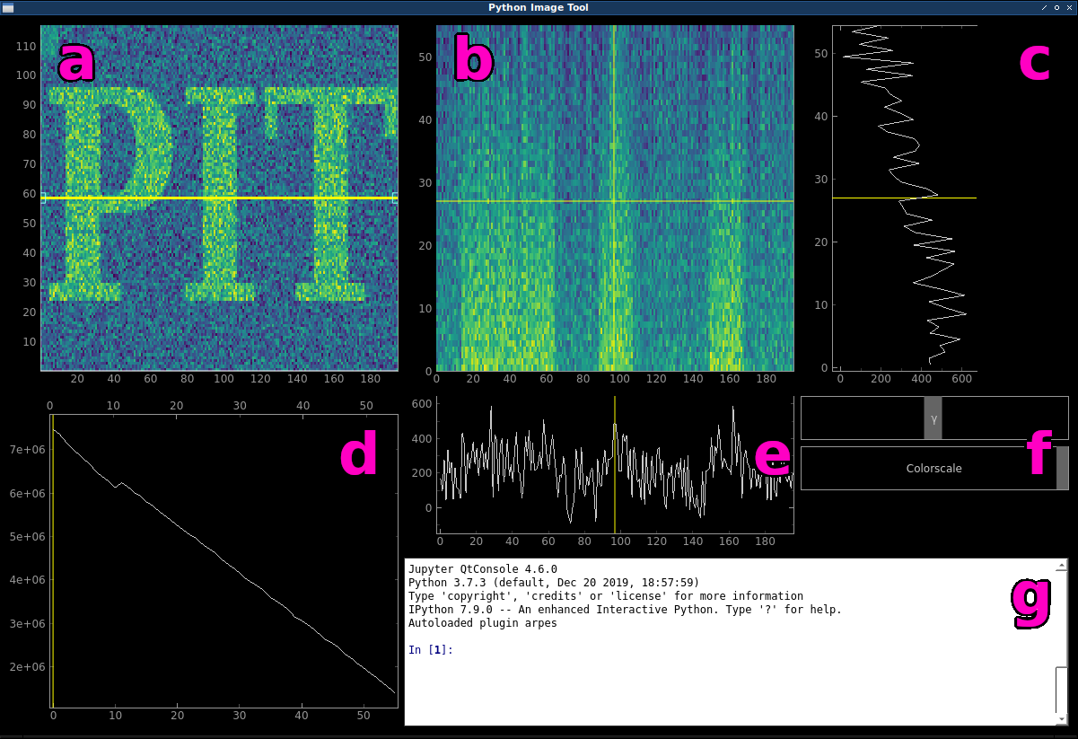
The main window of PIT.
| a | main data plot; mw.main_plot |
| b | cut plot; mw.cut_plot |
| c | vertical profile; mw.x_plot |
| d | integrated z plot; mw.integrated_plot |
| e | horizontal profile; mw.y_plot |
| f | colorscale sliders |
| g | interactive ipython console |
Main data plot and slice selection
If you imagine your 3D dataset as a cube (data cube), the main data plot (a) would initially represent what you would see when looking at the cube from the top. The horizontal x axis corresponds to the first dimension of your data cube, while the vertical y axis corresponds to the second. The integrated z plot (d) shows the sum of each xy slice along the third z dimension. You can drag the yellow slider to select a different slice to be displayed in the main data plot. Additionally, using the up and down arrow keys (after having clicked in the integrated z plot) allows you to in- or decrease the integration range for the slice. Left and right arrow keys move the slider step by step.
Creating arbitrary cuts
The yellow line inside the main data plot is called the cutline. It is draggable as a whole and at the handles. This is the knife that cuts through our data cube and the cut plot (b) shows what we see when we cut the data cube along the cutline. Hitting the r key will re-initialize the cutline alternatingly at an angle of 0 or 90 degrees. This is also useful if you happen to “lose” the cutline.
The horizontal and vertical profiles (c) and (e) just display the line profiles of the data shown in the cut plot along the cursor.
Colorscale sliders and the ipython console
The colorscale sliders (f) enable you to quickly change the min and max values of the colorscale as well as the exponent of the powerlaw normalization (gamma).
To change to used colormap, the ipython console (g) has to be used:
Type the command mw.set_cmap('CMAP_NAME').
Refer to the section about using the console for more.
Basics
Data is loaded by using the pit.open() command from the console.
Change the way we look at the data using pit.roll_axes() and overlay a model over the
displayed data with pit.overlay_model().
You can create a matplotlib figure of the main or cut plots by right clicking and choosing MPL Export.
Note
The Export… option from the right click menu is broken due to some error in pyqtgraph over which I have no control.
Refer to Using the console for more information on what you can do.
Footnotes
| [1] | This data set is taken from the OpenNeuro database.
Openneuro Accession Number: ds000108
Authored by: Wager, T.D., Davidson, M.L., Hughes, B.L., Lindquist,
M.A., Ochsner, K.N. (2008). Prefrontal-subcortical pathways mediating
successful emotion regulation. Neuron, 59(6):1037-50.
doi: 10.1016/j.neuron.2008.09.006 |